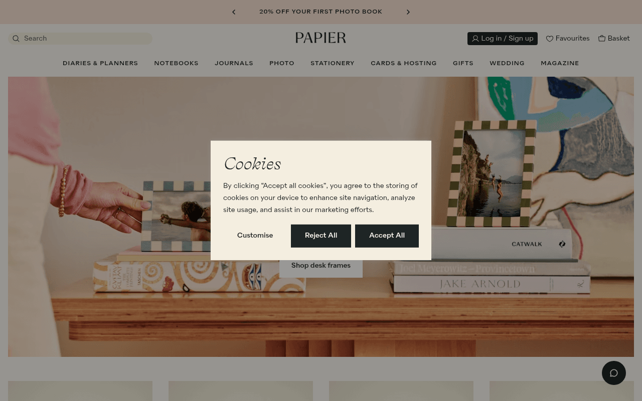
https://papier.com
https://papier.com
Screenshot of papier.com
55of 100
C−

Papier has genuine brand equity and a beautiful aesthetic, but the hero wastes it — 'Your world, on your desk' is a lifestyle whisper when the announcement bar is screaming 20% off photo books. The page has no testimonials, no star ratings above the fold, and 12 images missing alt text on a site where visual storytelling is the entire value proposition.

Your action plan

Ordered by conversion impact. Click any fix to see the before → after.

1
Align hero CTA with announcement bar offer
High ImpactQuick WinHero section — 'Shop desk frames' CTA vs. '20% OFF YOUR FIRST PHOTO BOOK' announcement bar
Currently
Hero promotes desk frames while top bar promotes photo book discount — mismatched intent
Recommended
Make the hero image and primary CTA match the highest-value offer in the announcement bar; create a dedicated photo book hero or add a secondary CTA button 'Get 20% off your first photo book'
Message match between ad/banner and landing content is the single highest-leverage conversion lever; misalignment causes immediate bounce from motivated buyers

Copy rewrites

Ready to use

Drop-in replacements for your highest-leverage text. Each rewrite explains the conversion principle behind it.

Hero H1
Your world, on your desk
Beautiful stationery, made yours
Specificity — the current line is atmospheric but communicates no product benefit or personalisation USP, which is Papier's core differentiator
Announcement bar
20% OFF YOUR FIRST PHOTO BOOK
20% off your first photo book — turn your camera roll into something beautiful
Benefit-led copy converts better than discount-only messaging; adds emotional reason-to-act alongside the price incentive
Email capture headline
Enjoy 10% OFF your first order
Get 10% off and be first to see new designs
Dual-benefit framing (discount + exclusivity) increases email opt-in rates by reducing the perception that you are only signing up for promotions
Meta description
Make each day noteworthy with our beautifully designed paper products. Personalised Papier notebooks, wedding stationery, photo books and more.
Beautifully designed, personalised stationery — notebooks, photo books, diaries and wedding stationery. Rated 4.7 stars by 13,000+ customers.
Social proof in meta descriptions increases organic CTR; adding the star rating differentiates Papier in a crowded SERP
💡

The killer move

High Impact
Launch a personalisation preview tool in the hero

Papier's true moat is personalisation — add an interactive name/monogram preview widget directly in the hero so visitors can type their name and see it on a notebook or diary in real time. This single feature would increase hero engagement, reduce time-to-first-personalisation, and make the brand promise viscerally tangible rather than implied.

How visitors experience your page

Second-by-second walkthrough.

1 strong2 mixed2 weak
0-3 secondsMixed
0-3s first impression: Cookie modal blocking hero, announcement bar with photo book discount, elegant serif logo, full-bleed desk frames lifestyle image
Cookie modal immediately obscures the hero message — visitor's first action is forced to be a consent decision, not product engagement. Brand aesthetic reads premium instantly, which is positive.
3-8 secondsMixed
3-8s hero evaluation: Hero headline 'Your world, on your desk', single 'Shop desk frames' CTA, lifestyle photography of checkered frames on a wooden desk
Visitor understands this is a lifestyle stationery brand but the headline is vague and the CTA promotes a niche sub-category. No price anchoring, no social proof, no urgency — motivated buyers have no reason to act now.
8-15 secondsStrong
8-15s category scanning: Product carousel showing desk frames with prices, 'Be the first to shop: Your MID-YEAR reset' editorial section, photo book product grid
Product variety and editorial content signal a rich catalogue. Pricing is visible. The mid-year diary angle is timely and relevant — visitors with a planning intent will engage here.
15-30 secondsWeak
15-30s trust assessment: Spring clean camera roll section with photo book products, The FOLD editorial content, Instagram feed section
No customer reviews, no star ratings, no UGC captions with social proof — visitor is being asked to consider purchase without any third-party validation. The Instagram section helps but lacks review context.
30+ secondsWeak
30s+ conversion decision: 10% off email capture form, footer with Trustpilot 4.7 stars rating, payment icons, extensive navigation links
The strongest trust signal (4.7 stars, 13,000+ reviews) appears only here, after most visitors have already decided whether to buy. Visitors who reach this point are likely either committed or lost — the page structure fails the undecided middle.

Health check

8 dimensions, weighted by conversion impact.

First impression & hero
20%
6/10
Visually beautiful but strategically unfocused — hero promotes desk frames while the top offer is photo books, and no trust signals are visible above the fold
Copy & messaging
20%
5/10
Brand voice is consistent and elegant but headlines are atmospheric rather than benefit-driven; personalisation USP is underplayed throughout
Call-to-action
15%
5/10
Single hero CTA misaligned with primary offer; no urgency, no secondary CTA, and the 10% email offer is buried at page bottom
Trust & social proof
15%
3/10
4.7-star Trustpilot rating with 13,000+ reviews exists but is hidden in the footer — a critical missed opportunity on a brand-building homepage
Visual design & layout
10%
8/10
Exceptionally cohesive aesthetic — warm tones, editorial photography, and consistent typography create a premium brand experience throughout
Page structure & flow
8%
6/10
Logical category progression but the editorial-to-commerce ratio is high; conversion moments are sparse and the email capture is too late in the flow
Technical & SEO signals
7%
7/10
PageSpeed 92 with 1.4s LCP is excellent; 12 images missing alt text and zero accessibility score reported are meaningful gaps for an image-heavy site
Differentiation & positioning
5%
6/10
Personalisation is Papier's core differentiator but the homepage barely mentions it — competitors could run the same hero image and headline

Page speed

Based on real Chrome user data
92/100
Overall score
Combined performance rating
1.4 s
Largest paint
Time until the main content is visible
0.01
Layout shift
How much the page moves while loading
1.1 s
First paint
Time until something first appears
76 ms
Responsiveness
How fast the page reacts to clicks

Want mobile analysis and fresh re-runs?

Buy roasts to unlock mobile analysis, re-analyze on demand, and more for papier.com.

See roast packs →