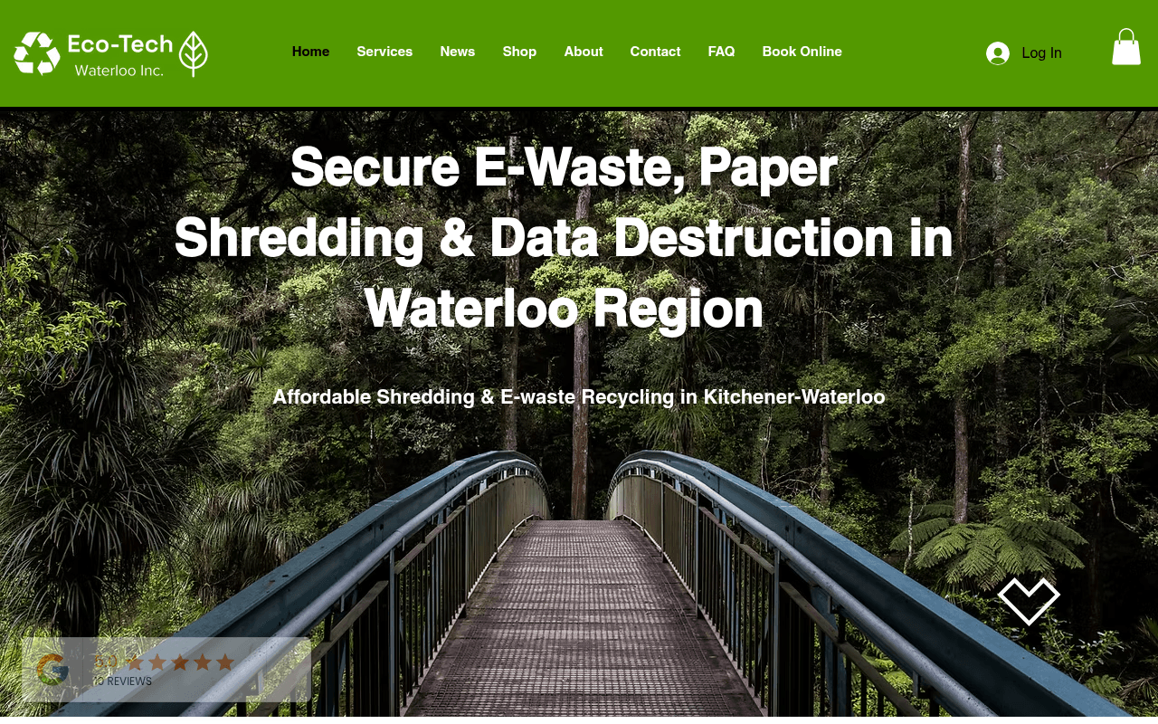
https://eco-techrecycling.com
Screenshot of eco-techrecycling.com
40of 100
F

A forest bridge photo is doing zero work selling shredding services — there's no CTA button above the fold, just a subheadline and a scroll arrow. The hero has the right headline but buries the conversion entirely, and a massive blank section below the fold (visible in full-page screenshot) suggests a broken or empty content block that's killing scroll momentum before visitors reach anything useful.

Your action plan

Ordered by conversion impact. Click any fix to see the before → after.

1
Add primary CTA button to hero above the fold
High ImpactQuick WinHero section — currently shows headline and subheadline only, no button visible at 1280px viewport
Currently
No CTA button visible in hero; 'Contact Us' and 'Services' buttons exist but are below fold
Recommended
Place two buttons directly under the subheadline: 'Get a Free Quote' (primary, green fill) and 'Book a Pickup' (secondary, outline) — both visible without scrolling
Nielsen's F-pattern and above-fold CTA research consistently show 20-40% lift when primary action is visible without scrolling; current layout forces users to hunt

Copy rewrites

Ready to use

Drop-in replacements for your highest-leverage text. Each rewrite explains the conversion principle behind it.

Hero subheadline
Affordable Shredding & E-waste Recycling in Kitchener-Waterloo
Certified, secure shredding and e-waste recycling — serving Kitchener-Waterloo since 2010.
Adds credibility signal (certified, since 2010) and replaces generic 'affordable' with trust-building specificity
Services section intro paragraph (first sentence)
Since 2010, Eco-Tech has proudly offered an extensive and thoughtfully curated suite of services that prioritize environmental sustainability and promote the practice of conscious living.
Since 2010, Eco-Tech has helped Waterloo Region businesses and residents securely destroy sensitive data and responsibly recycle electronics — with certified documentation every time.
Outcome-focused rewrite replaces vague brand language with specific customer benefits and a key differentiator (certified documentation)
Trusted Among Industry Leaders section body
Rest assured and feel a profound sense of confidence in the knowledge that we have thoughtfully and strategically partnered with a number of industry-leading organizations...
Eco-Tech is trusted by law firms, financial planners, medical clinics, and commercial businesses across Waterloo Region for secure, compliant data destruction and recycling.
Replaces bloated corporate filler with a concrete, scannable claim that names real audience segments — specificity builds trust faster than adjectives
💡

The killer move

High Impact
Add a service-specific landing page with instant quote calculator for each segment

Create separate conversion pages for Legal, Financial, Medical, and Commercial segments — each with tailored copy, a simple volume-based quote estimator, and a segment-specific CTA. This captures high-intent B2B traffic at the moment of self-identification and dramatically improves both SEO and conversion rate for the highest-value customers.

How visitors experience your page

Second-by-second walkthrough.

3 mixed2 weak
0-3 secondsMixed
0-3s first impression: Forest bridge hero image, large headline about e-waste and shredding, small subheadline, nav bar with Book Online, partial Google stars widget at bottom
Headline communicates the service and location clearly — that's good. But the nature image creates mild confusion and the absence of a visible CTA means the visitor has no immediate action to take. They understand what the company does but don't know what to do next.
3-8 secondsWeak
3-8s orientation: Scroll arrow icon, Google review widget, no CTA button — visitor likely scrolls down expecting content
The scroll arrow suggests more content below, but the massive blank section they hit immediately signals a broken page. High bounce risk at this exact moment — visitors interpret empty space as a loading failure or site error.
8-15 secondsMixed
8-15s exploration: Purchase Refurbished Technology section with man on laptop image, dense paragraph copy, Shop Now button
The refurbished tech section is unexpected on a shredding/recycling homepage — it's a secondary revenue stream presented as a primary message. Visitors seeking shredding services may feel they've landed on the wrong page.
15-30 secondsMixed
15-30s evaluation: Trusted Among Industry Leaders section with long paragraph, four industry category images (Legal, Financial, Medical, Commercial)
Industry segmentation is smart and relevant, but the body copy is dense and generic. The four category images help visitors self-identify, but there are no CTAs attached to each category to capture intent at this high-relevance moment.
30+ secondsWeak
30s+ decision: Blog post preview about hard drive shredding, Schedule a Pick-up button somewhere on page
By this point, a motivated visitor has scrolled through a broken blank section, a refurbished tech pitch, and a wall of text. The conversion architecture is too passive — no persistent CTA, no pricing signal, no urgency. Most visitors will leave without converting.

Health check

8 dimensions, weighted by conversion impact.

First impression & hero
20%
4/10
Correct headline, wrong image, no above-fold CTA — the three elements that matter most are 1-for-3
Copy & messaging
20%
4/10
Services copy is verbose and feature-focused; lacks outcome language, pricing signals, and scannable structure
Call-to-action
15%
3/10
No CTA visible above the fold; CTAs that exist are scattered and lack hierarchy or urgency
Trust & social proof
15%
4/10
Google reviews widget exists but is tiny and buried; no certifications, no client logos, no testimonial quotes visible
Visual design & layout
10%
5/10
Clean green brand palette works, but hero image mismatch and the large blank section undermine professionalism
Page structure & flow
8%
3/10
Blank section below hero breaks scroll flow; refurbished tech appears before core services in the narrative
Technical & SEO signals
7%
8/10
Performance score 93, FCP 544ms, LCP 1.2s — technically excellent; meta title and H1 are well-optimized for local search
Differentiation & positioning
5%
5/10
Since 2010 and local focus are mentioned but not amplified; certifications and ITAD capabilities are buried in body copy

Page speed

Based on real Chrome user data
93/100
Overall score
Combined performance rating
1.2 s
Largest paint
Time until the main content is visible
0.05
Layout shift
How much the page moves while loading
544 ms
First paint
Time until something first appears
39 ms
Responsiveness
How fast the page reacts to clicks

Want mobile analysis and fresh re-runs?

Buy roasts to unlock mobile analysis, re-analyze on demand, and more for eco-techrecycling.com.

See roast packs →