https://Oatsovernight.com
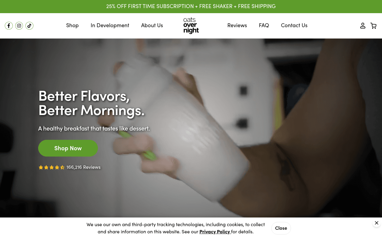
Screenshot of oatsovernight.com
65of 100
C+

166,216 reviews sitting below a generic 'Shop Now' CTA is a massive missed opportunity — that social proof should be the headline's wingman, not an afterthought. The hero image shows a blurry hand holding what appears to be a white cup against a dark background, which does almost nothing to communicate the product's appeal or the dessert-like taste promise in the subhead.

Your action plan

Ordered by conversion impact. Click any fix to see the before → after.

1
Replace hero background with appetite-driven product shot
High ImpactSome WorkHero section background image — currently a dark, blurry close-up of a hand holding a cup
Currently
Dark, low-contrast video/image showing an indistinct white container being held
Recommended
Full-bleed, bright lifestyle shot showing an open Oats Overnight container with visible colorful ingredients, ideally alongside a finished shake — make the product look delicious above the fold
Nielsen Norman research shows users form first impressions in 50ms; a dark, ambiguous hero image fails the 'what is this?' test and undermines the dessert-taste promise in the subhead

Copy rewrites

Ready to use

Drop-in replacements for your highest-leverage text. Each rewrite explains the conversion principle behind it.

Hero H1 headline
Better Flavors, Better Mornings.
The Breakfast That Tastes Like Dessert — And Takes 60 Seconds.
Specificity and benefit stacking — the current headline is vague; this version leads with the core differentiator (taste) and adds a concrete time-saving hook that speaks directly to the busy-professional audience
Hero subheadline
A healthy breakfast that tastes like dessert.
20g+ protein. No cooking. Just shake, sleep, and enjoy.
Specificity — swapping a generic claim for concrete product facts (protein count, zero-effort prep) answers the visitor's implicit question 'why should I care?' before they scroll
Okay, So What Is This? section headline
Okay, So What Is This?
High-Protein Oatmeal You Drink. Ready in 60 Seconds.
Clarity over cleverness — the current headline is conversational but delays comprehension; the rewrite front-loads the product category and key benefit for visitors who skimmed past the hero
Ingredients section headline
...And More Ingredients Than You Feel Like Buying.
Every Superfood You Should Be Eating — Already Inside.
Benefit framing — the current copy is self-deprecating humor that undersells; the rewrite positions the ingredient list as a feature (convenience + nutrition density) rather than an admission
💡

The killer move

High Impact
Surface the Flavor Development Program as a Hero-Level Differentiator

The subscriber-exclusive monthly flavor voting program is the single most defensible moat on this page — no competitor offers community-driven product development. Move a teaser of this above the fold as a secondary CTA ('Vote on Next Month's Flavor — Subscribers Only') to convert the subscription from a discount play into an exclusive community membership, which commands higher LTV and lower churn than price-based acquisition.

How visitors experience your page

Second-by-second walkthrough.

3 strong2 mixed
0-3 secondsMixed
0-3s First Impression: Dark hero image with blurry product, headline 'Better Flavors, Better Mornings', green announcement bar with 25% off offer, centered logo nav
The offer in the announcement bar is strong but the hero image fails to communicate what the product is or make it look appealing — visitors may not immediately understand this is a food product
3-8 secondsStrong
3-8s Value Assessment: Subhead 'A healthy breakfast that tastes like dessert', green Shop Now CTA, 4.5-star rating with 166,216 reviews
The subhead is the page's best copy and the review count is genuinely impressive — visitors who read this far get a clear value proposition and strong social validation, increasing scroll intent
8-15 secondsStrong
8-15s Product Understanding: New Here bundle section with product images, Okay So What Is This explainer with 3-step prep icons, refrigerator lifestyle image
The 3-step prep visual (mix, fridge, shake) is excellent for a novel product category — it removes the primary objection of 'this sounds complicated' and builds confidence to purchase
15-30 secondsMixed
15-30s Trust Building: 150M+ meals, 2.94M customers stats bar, nutrition callouts, No BS ingredient claims, subscriber-exclusive flavor development section
The scale stats are credible and the No BS section addresses health-buyer objections well, but the lack of actual customer testimonials or photos is a gap — the hasTestimonials flag is false, which is a missed trust opportunity at this scroll depth
30+ secondsStrong
30s+ Commitment Decision: Ingredient deep-dives, protein source comparison, money-back guarantee, love-it-or-swap guarantee, email capture, footer
The dual guarantee (money back + flavor swap) is conversion gold and should be surfaced much earlier — visitors who reach this point are well-informed but the guarantees arriving this late means many will have already bounced without seeing the risk-reversal

Health check

8 dimensions, weighted by conversion impact.

First impression & hero
20%
5/10
Strong offer bar and impressive review count are undermined by a dark, ambiguous hero image that fails to make the product look desirable or even identifiable
Copy & messaging
20%
7/10
Conversational brand voice is distinctive and the 3-step prep explainer is excellent; hero headline is too vague and the guarantee copy is buried too deep in the page
Call-to-action
15%
5/10
Generic 'Shop Now' CTAs throughout miss the opportunity to reinforce the 25% subscription offer at every decision point — offer specificity would lift click-through
Trust & social proof
15%
6/10
166K reviews and 2.94M customers are powerful numbers but zero actual testimonial quotes or customer photos appear on the page — a significant gap for a consumable product
Visual design & layout
10%
7/10
Clean green brand palette, good use of icons and section breaks; hero image is the main visual liability and 12 images missing alt text is an accessibility concern
Page structure & flow
8%
7/10
Logical education-first flow suits a novel product category well; guarantees appearing only at the bottom of a long page means most visitors never see the risk-reversal
Technical & SEO signals
7%
9/10
PageSpeed score of 95 with 1.3s FCP and 1.5s LCP is exceptional for an image-heavy ecommerce page — technical foundation is best-in-class
Differentiation & positioning
5%
7/10
Subscriber-exclusive monthly flavor development is a genuinely unique retention mechanic that competitors cannot easily replicate — it deserves more prominent above-fold real estate

Page speed

Based on real Chrome user data
95/100
Overall score
Combined performance rating
1.5 s
Largest paint
Time until the main content is visible
0.00
Layout shift
How much the page moves while loading
1.3 s
First paint
Time until something first appears
70 ms
Responsiveness
How fast the page reacts to clicks

Want mobile analysis and fresh re-runs?

Buy roasts to unlock mobile analysis, re-analyze on demand, and more for oatsovernight.com.

See roast packs →