https://kleoac.com
https://kleoac.com
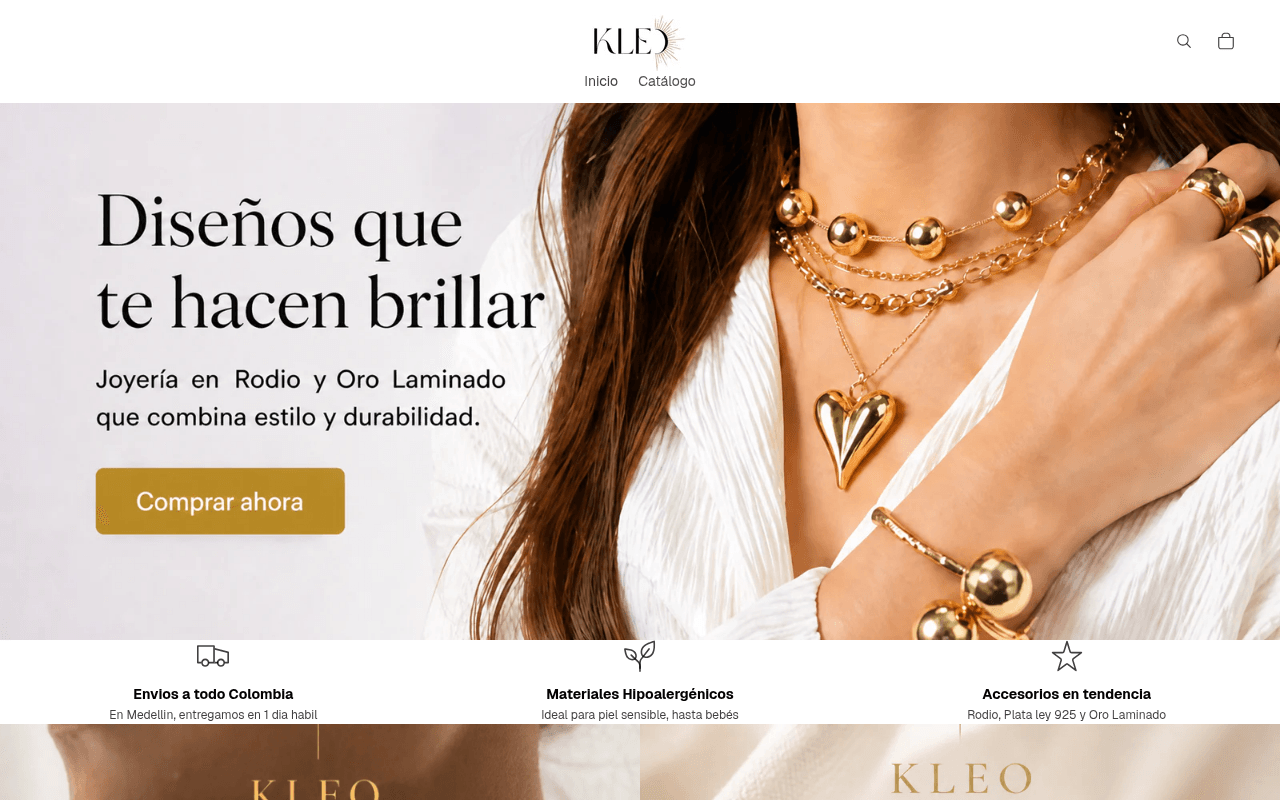
Screenshot of kleoac.com
55of 100
C−

The hero image is gorgeous and the product photography is strong, but 'Diseños que te hacen brillar' is a generic tagline any jewelry brand could claim. The full-page scroll reveals a wall of identically-priced rings with zero social proof, no reviews, and no reason to buy from KLEO over any Instagram boutique.

Your action plan

Ordered by conversion impact. Click any fix to see the before → after.

1
Add customer reviews or sold-count to product cards
High ImpactSome WorkProduct grid showing Anillo Baguette Rodio, Anillo Chunky Corazon, etc.
Currently
Product cards show only name and price ($20.000 COP) with no social proof
Recommended
Add star ratings (even aggregate) or a sold badge like '200+ vendidos' beneath each product name
Nielsen Norman research shows product-level social proof increases add-to-cart rates by 15-30%; currently hasTestimonials is false and no review count is visible anywhere on page

Copy rewrites

Ready to use

Drop-in replacements for your highest-leverage text. Each rewrite explains the conversion principle behind it.

Hero headline
Diseños que te hacen brillar
Joyería que dura — Rodio y Oro Laminado desde $20.000
Specificity + price anchoring: replaces an emotional platitude with a concrete differentiator and entry price point that qualifies visitors immediately
Hero subheadline
Joyería en Rodio y Oro Laminado que combina estilo y durabilidad.
Hipoalergénica, ideal para piel sensible. Envío en 1 día hábil en Medellín.
Benefit specificity: moves from feature description to customer-relevant outcomes, surfaces the delivery speed differentiator above the fold where it drives action
Trust bar — Materiales Hipoalergénicos
Ideal para piel sensible, hasta bebés
Certificado hipoalergénico — seguro para piel sensible y bebés
Authority signal: adding 'certificado' implies third-party validation and increases trust; the original reads like a marketing claim, the rewrite reads like a fact
Mid-page section headline
Elegancia que acompaña tu día
Piezas que van del trabajo a la noche — sin cambiar de look
Specificity + use-case visualization: gives the visitor a concrete scenario to project themselves into, which is a proven technique for fashion e-commerce engagement
💡

The killer move

High Impact
Launch a UGC social proof strip between hero and product grid

Insert a horizontal strip of 6-8 real customer Instagram photos wearing KLEO pieces, each with a first name and city tag, directly above the product grid. This single element addresses the page's biggest conversion gap — zero social proof — while simultaneously showcasing products in real-life context, which fashion research shows increases purchase intent by up to 29% versus studio-only imagery.

How visitors experience your page

Second-by-second walkthrough.

1 strong2 mixed2 weak
0-3 secondsStrong
0-3s First impression: Full-width hero with woman wearing layered gold jewelry, headline 'Diseños que te hacen brillar', olive CTA button, minimal nav with Inicio and Catálogo
Visual quality immediately signals a legitimate fashion brand; the jewelry photography is aspirational and on-trend. However the brand name KLEO AC means nothing yet — no tagline or category label clarifies what they sell without reading the subhead
3-8 secondsMixed
3-8s Value scan: Subheadline confirming Rodio y Oro Laminado, CTA button, and the three trust icons just entering viewport: shipping, hypoallergenic, trending accessories
The trust bar is valuable but arrives below the fold at 1280px — most visitors won't see it before deciding to scroll. The CTA fires before the visitor has a reason to click, creating a commitment-too-soon friction point
8-15 secondsMixed
8-15s Exploration: Trust bar fully visible, second hero banner, category navigation for Rodio products, beginning of product grid
Category structure is logical but the product grid shows a homogeneous wall of rings all at $20.000 COP with no differentiation signals — no bestseller badges, no new arrivals callouts, no reviews. Visitor has no cue on where to start
15-30 secondsWeak
15-30s Evaluation: Extensive product grid with 15+ ring variants, all identically priced, no ratings, no sold counts, no lifestyle context per product
Decision paralysis risk is high — too many similar options with no hierarchy. Without social proof or editorial curation, the visitor defaults to price comparison and likely exits to check competitors or Instagram boutiques
30+ secondsWeak
30s+ Conversion decision: More product cards, Más buttons, no visible footer trust signals, no reviews section, no Instagram feed or UGC
The page never closes the trust loop — no customer photos, no reviews, no follower count, no press mentions. A visitor who reached this point with purchase intent has no final reassurance to convert; cart abandonment is the likely outcome

Health check

8 dimensions, weighted by conversion impact.

First impression & hero
20%
7/10
Strong photography and clean layout create immediate brand credibility, but the headline is generic and the trust bar sits below the fold
Copy & messaging
20%
5/10
Functional but forgettable — every line could belong to any jewelry brand; no unique voice, no specific proof points in the hero
Call-to-action
15%
5/10
'Comprar ahora' fires before value is established; button color is distinctive but the label creates premature commitment friction
Trust & social proof
15%
3/10
Zero reviews, no testimonials, no UGC, no sold counts — the trust bar icons are the only reassurance and they are generic
Visual design & layout
10%
7/10
Cohesive warm gold palette, professional photography, clean typography — visually competitive with mid-tier fashion brands
Page structure & flow
8%
6/10
Logical hero-to-categories-to-products flow, but the product grid lacks editorial hierarchy and creates decision paralysis
Technical & SEO signals
7%
7/10
Exceptional PageSpeed score of 97, LCP 1.2s is excellent; SEO score 85 is dragged down by missing meta description and 8 images without alt text
Differentiation & positioning
5%
4/10
Hypoallergenic materials and Medellín same-day delivery are genuine differentiators buried below the fold and never amplified

Page speed

Tested via Google Lighthouse
97/100
Overall score
Combined performance rating
1.2 s
Largest paint
Time until the main content is visible
0.004
Layout shift
How much the page moves while loading
0.4 s
First paint
Time until something first appears
2.0 s
Interactive
Time until the page is fully usable
Accessibility: 78SEO: 85Best Practices: 92

Want mobile analysis and fresh re-runs?

Buy roasts to unlock mobile analysis, re-analyze on demand, and more for kleoac.com.

See roast packs →