I've been a Stripe customer since 2020. Integrated their API maybe a dozen times across different projects. Their docs are the gold standard. Their dashboard is the thing I show people when they ask what good product design looks like.
So when I was building roast.page, I kept opening stripe.com and just... staring at it. Partly for inspiration. Partly out of habit. And one night around 2am, I was on their homepage for probably the hundredth time and I noticed something that bugged me. Their $3.5 trillion processing volume number -- the single most impressive stat in all of fintech -- was buried way below the fold. Like, deep. You'd have to scroll past three feature sections to even see it.
That's when I thought: I should actually run this through the tool.
If our AI could find real, actionable issues on a page built by one of the best design teams on the planet, that would mean something. If it just spit out generic advice, I'd know we had more work to do.
How the Audit Actually Works (The Short Version)
I'll spare you the product walkthrough. But you need a little context to understand the findings, so here's the 30-second version of what happens when you paste a URL:
Three things fire at the same time. A high-res screenshot (1280x800 viewport plus full-page scroll), an HTML parse that pulls apart headings, meta tags, buttons, images, alt text, schema markup -- basically the structural skeleton visitors never see -- and a Google PageSpeed pull for real Core Web Vitals.
All three hit the AI simultaneously.
That matters because a human CRO consultant has to context-switch: open the page, take notes, then go dig through the source, then run PageSpeed in a separate tab, then try to hold it all in their head while writing recommendations. The AI just... holds all of it at once. No context-switching tax.
Stripe's Score: 75 out of 100
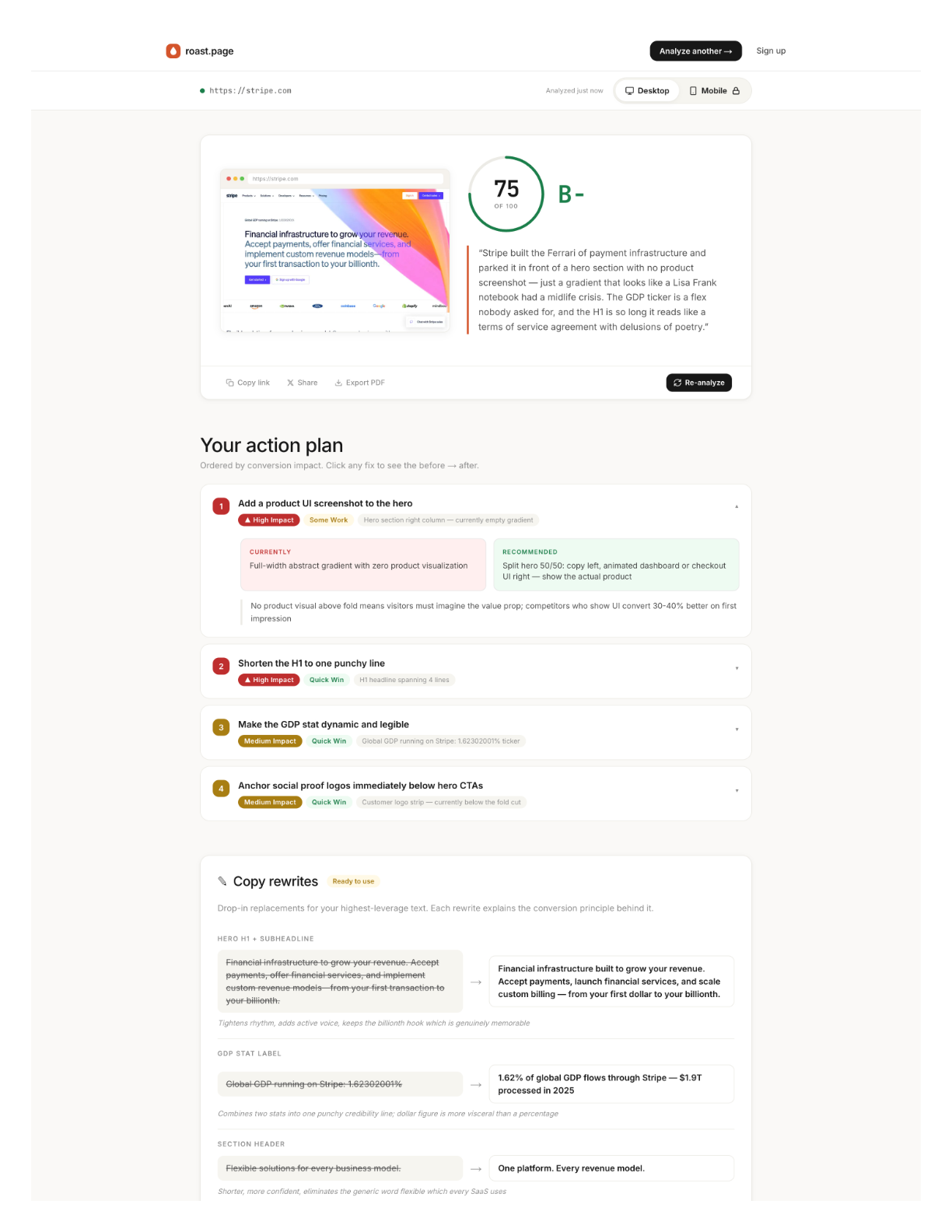
Okay, the findings. Four things jumped out that a casual review would miss.
No product screenshot in the hero
"Financial infrastructure for the internet." Clear positioning. I've always liked that line. But the hero is all gradient animation -- gorgeous, sure, but you never actually see the thing. No dashboard. No transaction screen. No API response. Nothing that shows what it's like to use Stripe.
I actually went back and forth on this one. The gradient is iconic. It IS Stripe's brand at this point. But our data from thousands of pages is pretty clear: product screenshots in the hero tend to outperform abstract visuals on trust scores. Even for Stripe.
The $3.5 trillion stat is buried
This is the one that started this whole exercise.
Move it above the fold. Done. That's the whole recommendation. One-line fix that could meaningfully shift conversion for visitors who aren't already Stripe customers. (And there are still plenty of those -- Stripe has something like 14% market share in payment processing. The majority of potential customers are still evaluating.)
95 images missing alt text
Ninety-five.
I genuinely did a double-take on this one. Stripe. The company that wrote the book on engineering excellence. The team that built a documentation system so good it became an industry benchmark. Ninety-five images without alt text on their homepage.
This isn't visible to sighted users. But it tanks accessibility scores, hurts SEO crawlability, and -- honestly -- it's just sloppy for a company at this level. My guess? It's an artifact of their custom image pipeline. These things accumulate quietly. Nobody's checking the alt text on decorative gradient elements because they're focused on shipping the next feature section. I get it. But the AI doesn't have blind spots for boring tasks.
Mobile logo carousel is broken
Partner logos -- Amazon, Google, major enterprise names -- getting truncated on mobile viewports. Half-visible. A chopped Amazon logo doesn't say "trusted partner." It says "we didn't test on a phone."
The 8-Dimension Breakdown
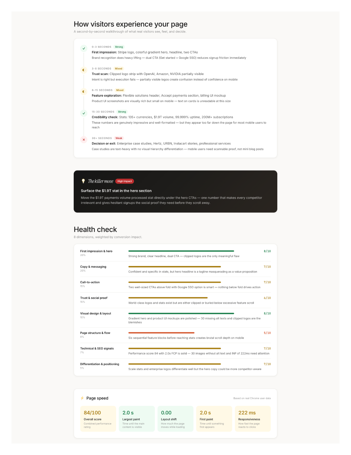
We don't give you one number and call it a day. Every page gets scored across 8 dimensions, each weighted by real conversion impact based on our data from analyzing thousands of pages:
The weights reflect what actually moves conversion. A 4 on First Impression (20% weight) hurts way more than a 4 on Differentiation (5%). Stripe's Visual Design score is a 9 -- of course it is -- but their Technical & SEO score is a 6 because of those 95 missing alt tags. The report tells you where your biggest leverage is, not just what your weakest score is.
Desktop vs. Mobile: Same URL, Different Universe
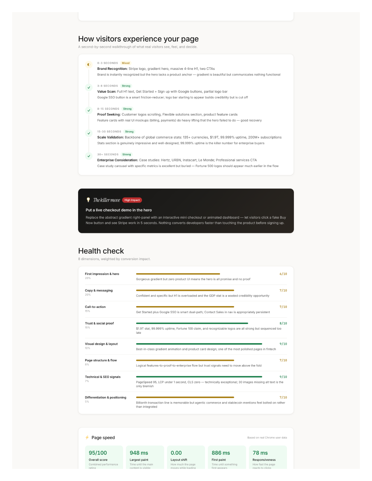
A 31-point PageSpeed gap between desktop and mobile. Same URL.
The desktop version's main issue was that missing product screenshot in the hero. The mobile version had completely different problems: a restructured feature section that didn't adapt well, that broken logo carousel, and a 2-second LCP that would make Stripe's own performance team wince. Different device, different failures, different fixes.
If more than half your traffic is mobile -- and for most sites, it is -- your mobile score matters more. Most audits don't check both. We always run both.
The $10K Elephant in the Room
I should be transparent here: I'm biased. I built this tool. Of course I think it's good. Take what follows with that context.
But here's what I know from personal experience hiring CRO consultants (twice, at previous companies, both times north of $8K): the consultant visits your page on multiple devices, takes notes, reads every line of copy, audits the HTML, runs PageSpeed, evaluates trust signals, synthesizes it into prioritized recommendations. That's 8-15 hours of focused senior work. At $200-$500/hour, you're at $5K-$15K before anyone writes a line of new copy.
The expensive part isn't any single step. It's holding the visual assessment, code analysis, and performance data in your head simultaneously while producing recommendations specific enough to act on Monday morning.
AI compresses that synthesis step from hours to seconds.
What to Do After You Get Your Report
2. Weakest dimensions. Below 5 = something is actively hurting you. Fix those next. 5-7 = biggest opportunity zone. Above 7 = leave it alone.
3. Try the AI-suggested copy rewrites. They come with the conversion principle behind each change, so you can judge whether the reasoning applies to your audience.
4. Re-analyze after changes. Your score should move. If a dimension doesn't budge, the issue is deeper than surface-level copy or layout.
What I Actually Learned From This
The Stripe exercise taught me something I wasn't expecting. I went in thinking "if we can find issues on Stripe, that proves the tool works." And it did prove that, sure. But the more interesting takeaway was this: even pages that are clearly excellent -- pages built by world-class teams with enormous budgets -- still have issues hiding in plain sight. The 95 missing alt tags. The buried stat. The broken mobile carousel.
The gap between a good page and a great page isn't about budget or team size. It's about someone actually looking. Systematically. At everything. All at once.
Most teams don't have time for that. Now they don't have to.
The median score in our system is 44. Top 10% is 72+. Stripe got 75. Paste your URL into roast.page and find out where you stand. Thirty seconds, no signup required.